
Chapter 7: ML Scatter Plots
ML Scatter Plots (the most important first graph you should always draw in Machine Learning).
I’m explaining this like your favorite teacher in Hyderabad: slowly, with stories from real life (like flats in Gachibowli or exam marks), no rush, and clear pictures in your mind. By the end, you’ll understand why every ML person starts with a scatter plot — it’s like the “X-ray” of your data!
What Exactly is a Scatter Plot in Machine Learning?
A scatter plot is a simple graph where:
- Each data point becomes a dot on the paper/screen
- One variable (feature/input) goes on the x-axis (horizontal)
- The other variable (target/output/what we want to predict) goes on the y-axis (vertical)
We plot all our data points this way → then look at the pattern of dots.
In ML, scatter plots are used for:
- See if two variables have a relationship (correlation)
- Check if the relationship is linear (straight line-ish) or curved/random
- Spot outliers (weird lonely dots)
- Decide which ML model to use next (linear regression? or something non-linear?)
- Understand data before training any model — never skip this!
Everyday Hyderabad Example: Flat Size vs Price
Imagine you collected data for 2BHK flats in Hyderabad (from 99acres, Magicbricks, friends…):
- x = Size in square feet
- y = Price in lakhs
Some rows:
- 800 sq ft → ₹48 lakh
- 950 sq ft → ₹55 lakh
- 1200 sq ft → ₹72 lakh
- 1500 sq ft → ₹88 lakh
- 1800 sq ft → ₹105 lakh
- (and many more…)
When you make a scatter plot:
- Dots start low-left (small flat, cheap)
- Go up-right (bigger flat, more expensive)
- Mostly form a cloud sloping upward
This upward cloud tells us: Positive relationship — as size increases, price tends to increase.
Now imagine we add a best-fit line (from linear regression, like we talked last time) — the line cuts through the middle of the dot cloud.

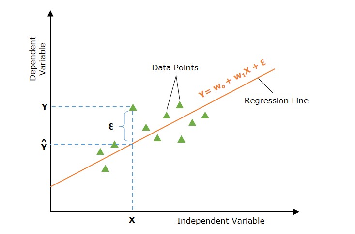
See how the green line hugs most blue dots? That’s what a good scatter plot + linear trend looks like!
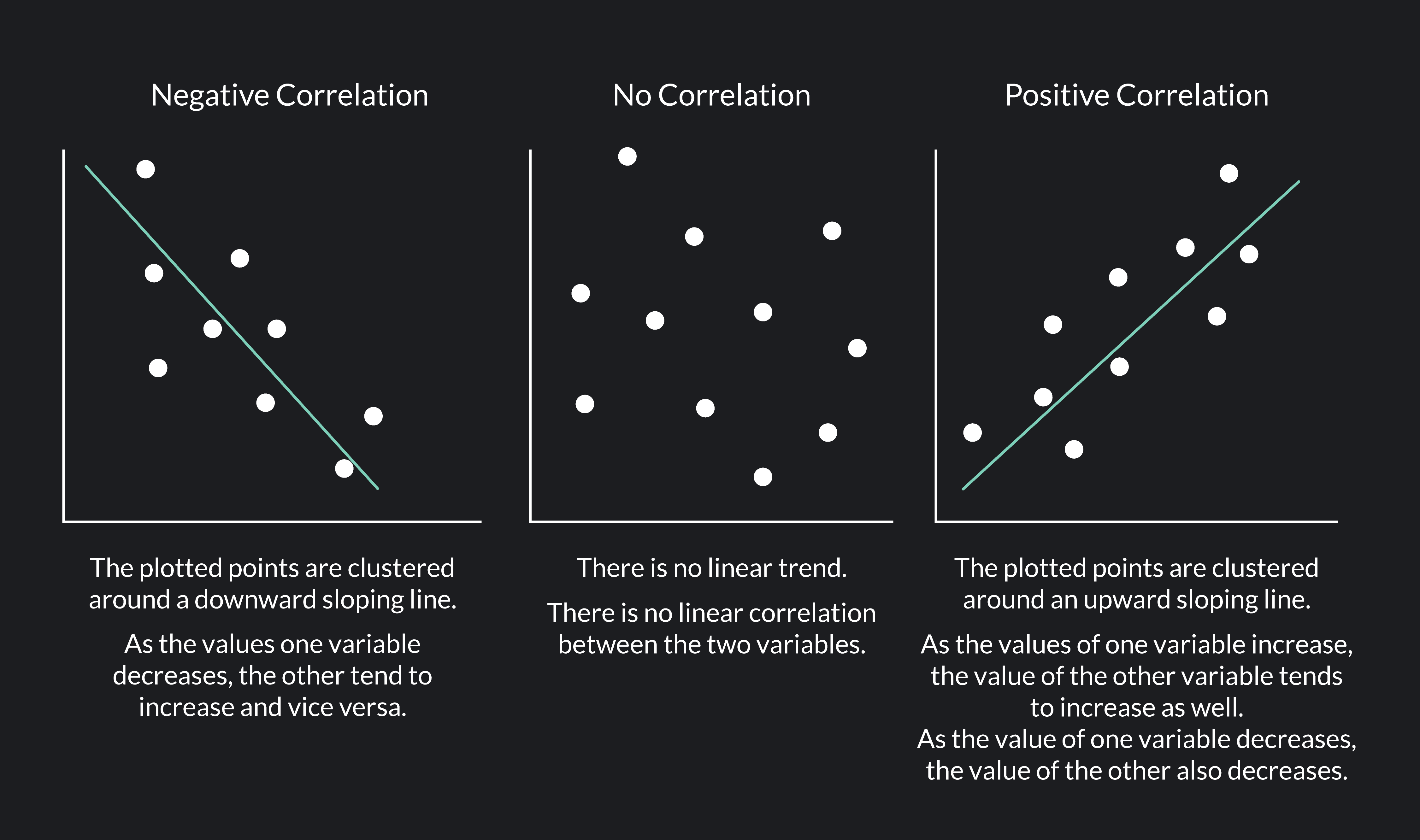
Types of Patterns You See in Scatter Plots (Very Important!)
-
Strong Positive Correlation (dots hug upward line)
- Example: Study hours vs Exam score
- More hours → higher score
- Dots cluster tightly around upward-sloping line

-
Strong Negative Correlation (dots hug downward line)
- Example: Age vs Internet usage hours per week (younger people use more internet)

- Or classic: Car age vs Resale price (older car → lower price)
-
No Correlation / Random (dots everywhere, no trend)
- Example: Number of chicken eggs sold on farms vs Ice creams sold (no logical link)
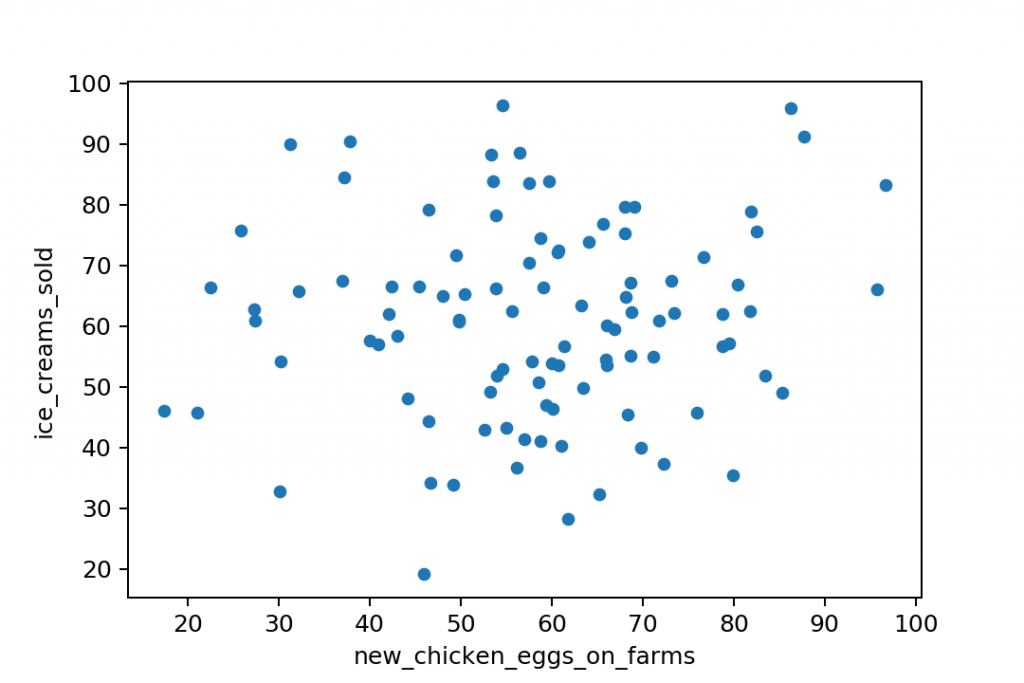
- Dots scattered randomly → no pattern → don’t waste time trying linear model here!
-
Weak Correlation (some trend but lots of spread)
- Dots go up/down but very spread out
- Still useful, but model won’t be super accurate
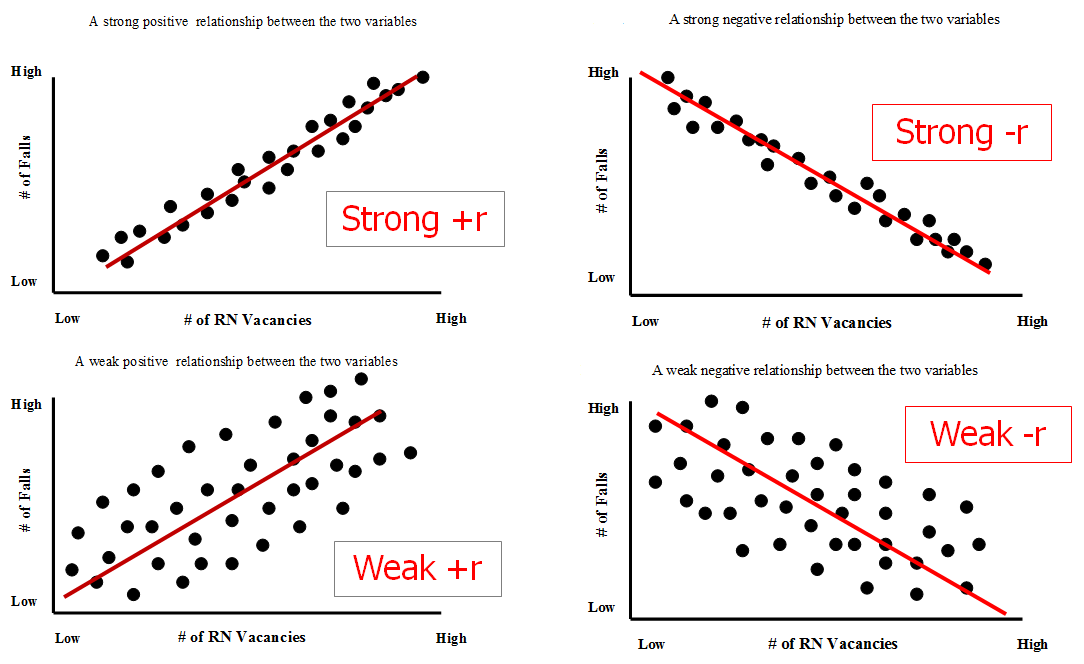
(Look at the weak +r and weak -r examples)
-
Non-linear / Curved (not straight!)
- Example: House price vs Size — increases fast at first, then slows for very big houses
- Dots form a curve → linear regression bad idea → need polynomial / decision tree etc.
Another Famous ML Example: Iris Dataset (What Teachers Love)
Sepal Length vs Petal Length (different species colored differently):
- Setosa (blue) → short petals, short sepals
- Versicolor & Virginica → longer, with clear upward trend
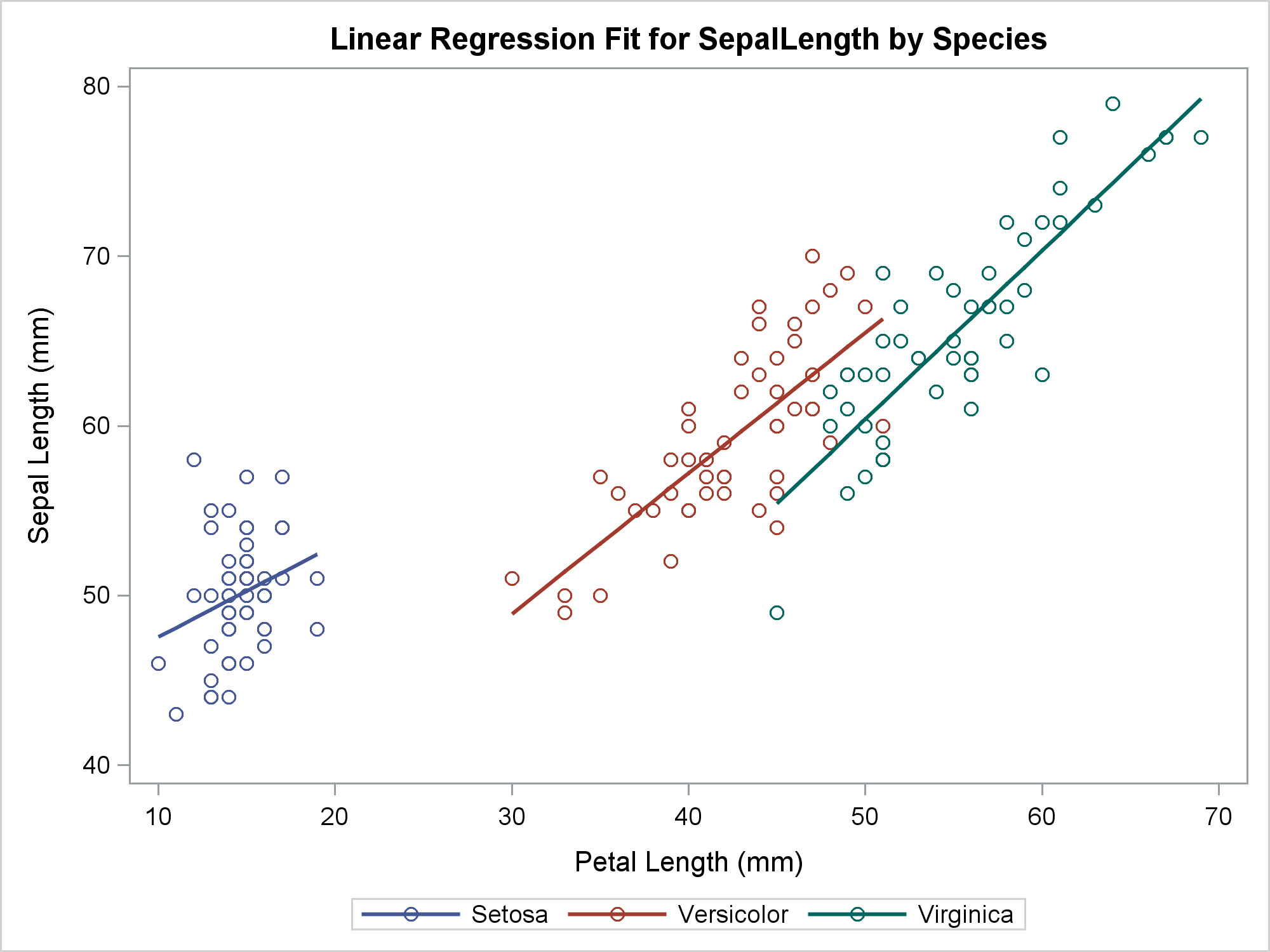
See clusters + overall positive trend? This scatter plot helps decide: “Linear might work overall, but species groups are separate → maybe classification instead of regression.”
Quick Cheat-Sheet Table (Copy This!)
| Pattern Seen in Scatter Plot | What It Means | Correlation Type | Next ML Step Suggestion | Example |
|---|---|---|---|---|
| Dots hug upward line tightly | As x ↑, y ↑ strongly | Strong +ve | Try Linear Regression | Flat size vs price |
| Dots hug downward line tightly | As x ↑, y ↓ strongly | Strong -ve | Try Linear Regression (negative slope) | Age vs internet hours |
| Dots scattered randomly | No relationship | None | Don’t use regression — try other features | Ice cream vs chicken eggs |
| Dots loosely follow line | Some relationship but noisy | Weak +ve / -ve | Linear possible, but expect error | Advertising spend vs weak sales |
| Dots form curve / bend | Non-linear relationship | Non-linear | Polynomial, trees, neural nets | Salary vs experience (diminishing) |
| Separate clusters by color/group | Groups behave differently | Grouped | Add category feature or classify first | Iris flowers by species |
Teacher’s Final Words (2026 Advice)
Scatter plot is step ZERO in ML — before any model, code, or training: Plot your data! Your eyes spot things no number can (outliers, curves, clusters).
In Python it’s super easy (matplotlib / seaborn):
|
0 1 2 3 4 5 6 7 8 9 10 11 |
import matplotlib.pyplot as plt plt.scatter(df['size_sqft'], df['price_lakh']) plt.xlabel("Size (sq ft)") plt.ylabel("Price (₹ lakh)") plt.title("Hyderabad Flats: Size vs Price") plt.show() |
Do this for every important pair of variables!
Got it now? 🔥
Questions?
- Want Python code to make these plots yourself?
- How to add best-fit line to scatter plot?
- What if 3+ variables (pairplot / 3D scatter)?
Just say — next lesson ready! 🚀


