
Chapter 6: HTML & CSS Foundations
Foundations of HTML & CSS in 2026 — the core concepts that separate “I can make a page” from “I understand how websites actually work.”
- Bad foundation → house looks okay for a week, then cracks everywhere when rain comes
- Good foundation → can add floors, fancy paint, solar panels later without worry
HTML foundations = strong skeleton + meaningful rooms CSS foundations = how rooms are painted, spaced, and arranged so people (and search engines) love it
I’ll explain in detail with analogies, key rules, common beginner mistakes, and a complete example you can build right now.
1. HTML Foundations – Semantic & Accessible Structure
Modern HTML (HTML5 since ~2014, still king in 2026) is semantic — tags tell meaning, not just looks.
Why semantic matters:
- Screen readers for blind users read better
- Google ranks better (SEO)
- Future CSS/JS easier to target
- Code readable when you return after 6 months
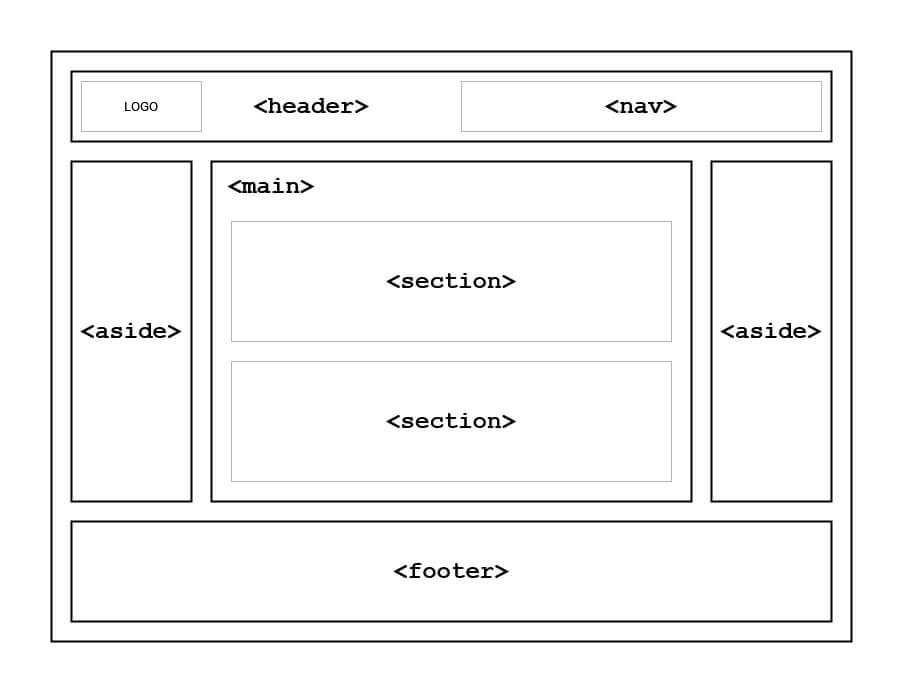
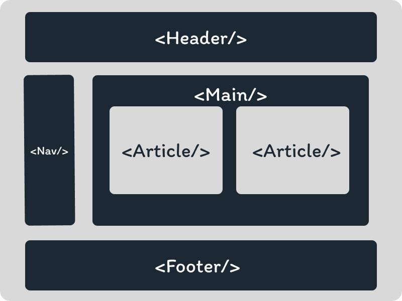
Core semantic tags (must-know foundations):
| Tag | Meaning / When to use | Example use case | Wrong/old way people still use |
|---|---|---|---|
| <header> | Introductory content (logo + nav usually) | Top banner of page | Just <div class=”top”> |
| <nav> | Main navigation links | Menu bar | <div id=”menu”> |
| <main> | The primary unique content of the page | The main article/body | Nothing — just dump in <body> |
| <section> | Thematic grouping of content | “About me” block, “Skills” block | <div class=”block”> |
| <article> | Self-contained content (can stand alone) | Blog post, product card | <div class=”post”> |
| <aside> | Sidebar / related but secondary content | Ads, quick links, author bio | <div class=”side”> |
| <footer> | Closing content (copyright, social links) | Bottom of page | <div class=”bottom”> |
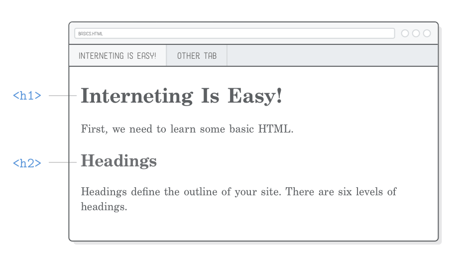
| <h1>–<h6> | Headings — hierarchy is very important | <h1> only once per page usually | All <h1> or font-size hacks |
Quick rule: If you can give it a meaningful name like “about-section” or “contact-form” → it probably deserves a semantic tag instead of plain <div>.
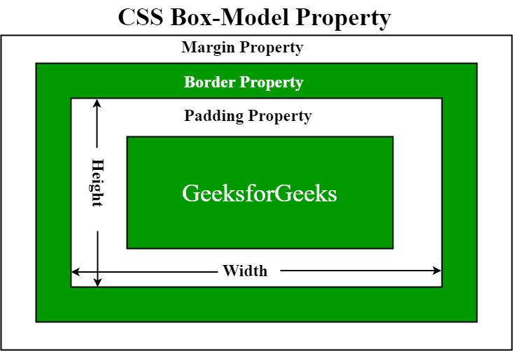
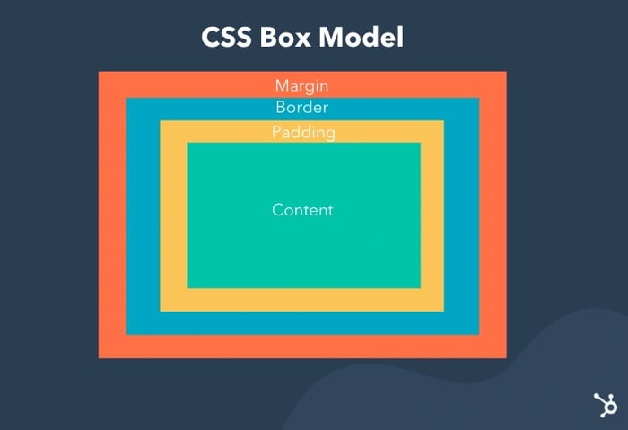
2. CSS Foundations – The Box Model (Most Important Concept!)
Every single element on a webpage is a box. Seriously — text, images, buttons, everything.
The CSS Box Model has 4 layers (from inside to outside):
- Content → the actual text/image (width + height)
- Padding → space inside the border (like cushion around content)
- Border → line around padding
- Margin → space outside the border (separates from other boxes)
Visual example (classic diagram):
Key gotcha beginners miss:
|
0 1 2 3 4 5 6 |
box-sizing: border-box; /* → THE MOST IMPORTANT LINE IN CSS 2026 */ |
Without it → width: 300px + 20px padding + 10px border = total 350px (annoying!) With border-box → total width stays 300px (padding + border eat inside)
Put this at the top of every CSS file:
|
0 1 2 3 4 5 6 7 8 9 10 |
* { margin: 0; padding: 0; box-sizing: border-box; } |
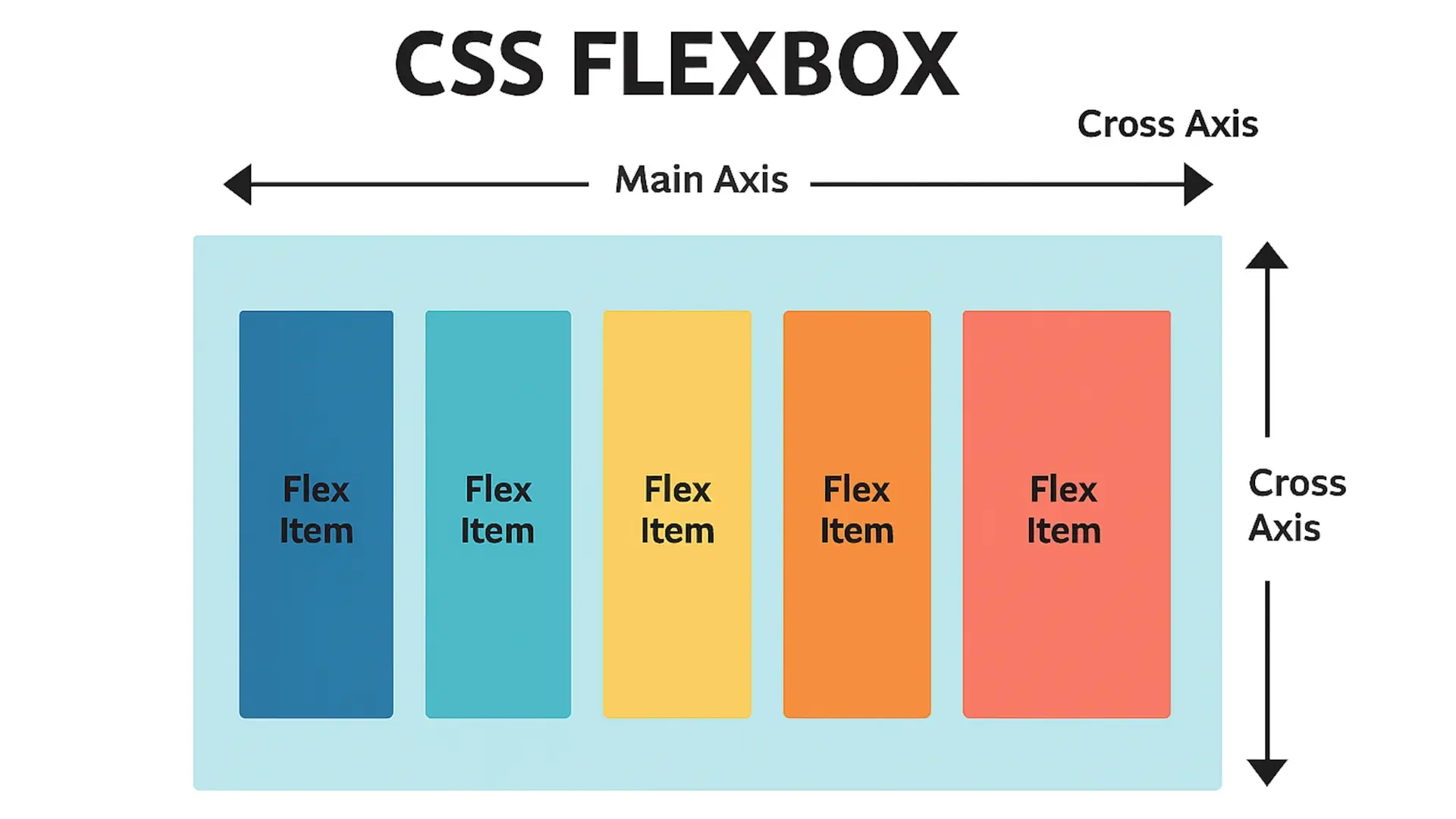
3. Layout Foundations – Flexbox (The Modern Hero)
Forget old float: left nightmares. In 2026, Flexbox is the foundation for almost every layout (1D — rows or columns).
Basic idea:
- Make a parent .container { display: flex; }
- Children become flex items → align easily horizontally/vertically
Quick cheat-sheet:
|
0 1 2 3 4 5 6 7 8 9 10 11 12 |
.container { display: flex; flex-direction: row; /* or column */ justify-content: center; /* main axis alignment */ align-items: center; /* cross axis alignment */ gap: 20px; /* space between items */ } |
Visual example of flex items in a row:
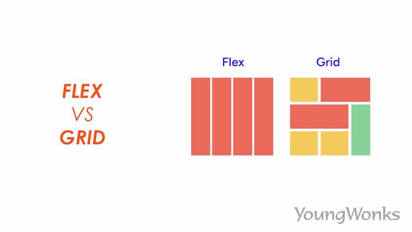
(We’ll do Grid later — that’s for 2D layouts like full page sections)
4. Your First “Foundations-Level” Page – Put It All Together
Create index.html and style.css in your VS Code project folder.
index.html
|
0 1 2 3 4 5 6 7 8 9 10 11 12 13 14 15 16 17 18 19 20 21 22 23 24 25 26 27 28 29 30 31 32 33 34 35 36 37 38 39 40 41 42 43 44 45 46 47 48 49 50 51 52 53 54 55 56 57 58 59 60 61 62 63 |
<!DOCTYPE html> <html lang="en"> <head> <meta charset="UTF-8"> <meta name="viewport" content="width=device-width, initial-scale=1.0"> <title>Webliance – Foundations Demo</title> <link rel="stylesheet" href="style.css"> <link href="https://fonts.googleapis.com/css2?family=Inter:wght@400;600;700&display=swap" rel="stylesheet"> </head> <body> <header class="site-header"> <div class="container"> <h1>Webliance</h1> <nav> <a href="#about">About</a> <a href="#skills">Skills</a> <a href="#contact">Contact</a> </nav> </div> </header> <main> <section class="hero"> <div class="container"> <h2>Learning Web Foundations in Hyderabad</h2> <p>Semantic HTML + Box Model + Flexbox = Strong base for any website</p> </div> </section> <section id="about" class="section"> <div class="container"> <h3>About This Page</h3> <p>This uses real semantic structure, border-box everywhere, and flex for layout.</p> </div> </section> <section id="skills" class="section skills"> <div class="container"> <h3>Current Skills</h3> <div class="skills-grid"> <div class="skill-card">HTML5 Semantics</div> <div class="skill-card">CSS Box Model</div> <div class="skill-card">Flexbox Layout</div> <div class="skill-card">Mobile-first Thinking</div> </div> </div> </section> </main> <footer> <div class="container"> <p>© 2026 Webliance • Built with chai & patience ☕</p> </div> </footer> </body> </html> |
style.css
|
0 1 2 3 4 5 6 7 8 9 10 11 12 13 14 15 16 17 18 19 20 21 22 23 24 25 26 27 28 29 30 31 32 33 34 35 36 37 38 39 40 41 42 43 44 45 46 47 48 49 50 51 52 53 54 55 56 57 58 59 60 61 62 63 64 65 66 67 68 69 70 71 72 73 74 75 76 77 78 79 80 81 82 83 84 85 86 87 88 89 90 91 92 93 94 95 96 97 98 99 100 101 102 103 |
* { margin: 0; padding: 0; box-sizing: border-box; } body { font-family: 'Inter', system-ui, sans-serif; background-color: #f8fafc; color: #1e293b; line-height: 1.6; } .container { max-width: 1100px; margin: 0 auto; padding: 0 20px; } /* Header */ .site-header { background: #1e40af; color: white; padding: 1.5rem 0; } .site-header .container { display: flex; justify-content: space-between; align-items: center; } .site-header h1 { font-size: 2rem; } nav a { color: white; text-decoration: none; margin-left: 2rem; font-weight: 600; } nav a:hover { text-decoration: underline; } /* Hero */ .hero { background: linear-gradient(135deg, #3b82f6, #1d4ed8); color: white; text-align: center; padding: 8rem 0 6rem; } .hero h2 { font-size: 3rem; margin-bottom: 1rem; } /* Sections */ .section { padding: 5rem 0; text-align: center; } .section h3 { font-size: 2.2rem; margin-bottom: 2rem; color: #1e40af; } /* Skills – Flexbox in action */ .skills-grid { display: flex; flex-wrap: wrap; gap: 1.5rem; justify-content: center; } .skill-card { background: white; padding: 2rem; border-radius: 12px; box-shadow: 0 4px 15px rgba(0,0,0,0.1); width: 100%; max-width: 280px; font-weight: 600; font-size: 1.3rem; } /* Footer */ footer { background: #0f172a; color: #94a3b8; text-align: center; padding: 3rem 0; } |
Right-click → Open with Live Server → refresh magic!
Here are some beginner foundation pages for inspiration (yours will look similar but cleaner):


And semantic structure visuals:
Quick Foundations Checklist (Print or Bookmark This)
- Using semantic tags instead of only <div>
- * { box-sizing: border-box; } at top
- Flexbox for simple rows/columns
- Mobile-first (start small screen styles)
- <meta viewport> always there
- Meaningful class names (.hero, .skills-grid, not .box1)
You’ve now got the real foundations — everything else (animations, JS, Tailwind, React) builds on top of this.
How’s the page looking on your screen? Want next: “responsive with media queries”, “intro to CSS Grid”, “make a full tribute page”, or “start forms”?
Keep building — you’re past the shaky beginner phase now. Chai + strong foundations = unstoppable combo ☕🚀


