
Chapter 4: SVG Rectangle
SVG <rect> element — the simplest and most frequently used shape in SVG after the circle.
Imagine we’re sitting together with a whiteboard. I’ll explain everything slowly like a patient teacher, step by step, with real examples you can copy-paste right now.
What is <rect> really?
<rect> = rectangle (surprise 😄)
It draws a rectangle (or square if width = height). It is one of the basic shape elements in SVG (together with <circle>, <ellipse>, <line>, <polyline>, <polygon>).
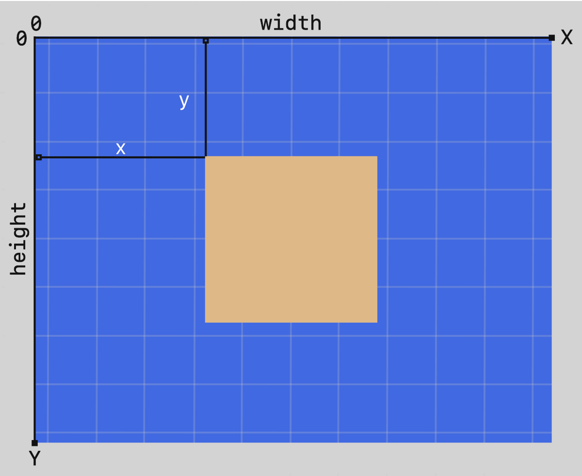
The rectangle always starts from a top-left corner point → then goes right (width) and down (height).
Important: In SVG coordinates:
- 0,0 is top-left corner of the <svg> canvas (very different from math graphs where y grows upward)
- x grows to the right
- y grows downward
The 6 most important attributes of <rect>
| Attribute | Meaning | Required? | Default | Can be animated? | Units / values |
|---|---|---|---|---|---|
| x | Left edge position | No | 0 | Yes | number, %, etc. |
| y | Top edge position | No | 0 | Yes | number, %, etc. |
| width | How wide (horizontal size) | Yes | — | Yes | number > 0, % |
| height | How tall (vertical size) | Yes | — | Yes | number > 0, % |
| rx | Horizontal corner radius (rounding) | No | 0 (sharp) | Yes | number, % |
| ry | Vertical corner radius (rounding) | No | = rx or 0 | Yes | number, % |
You also almost always use these styling attributes (same as other shapes):
- fill — inside color (default = black)
- stroke — border color (default = none)
- stroke-width — border thickness (default = 1)
- opacity, fill-opacity, stroke-opacity, etc.
Example 1 – Basic sharp rectangle (most common starting point)
|
0 1 2 3 4 5 6 7 8 9 10 11 12 13 14 15 16 17 18 |
<svg width="500" height="300" style="border:1px solid #ddd; background:#f8f9fa;"> <rect x="80" y="60" width="340" height="180" fill="#4CAF50" stroke="#2E7D32" stroke-width="6" /> </svg> |
What you see:
- Green filled rectangle
- Dark green 6px border
- Starts 80 units from left edge, 60 units from top
Here is a visual example of how x, y, width, height work (coordinate system):

Example 2 – Square (width = height)
|
0 1 2 3 4 5 6 7 8 9 10 11 12 13 14 15 16 17 18 19 20 21 22 |
<svg width="220" height="220"> <rect x="20" y="20" width="180" height="180" fill="none" stroke="#FF5722" stroke-width="12" /> <text x="110" y="115" font-size="32" text-anchor="middle" fill="#FF5722"> SQUARE </text> </svg> |
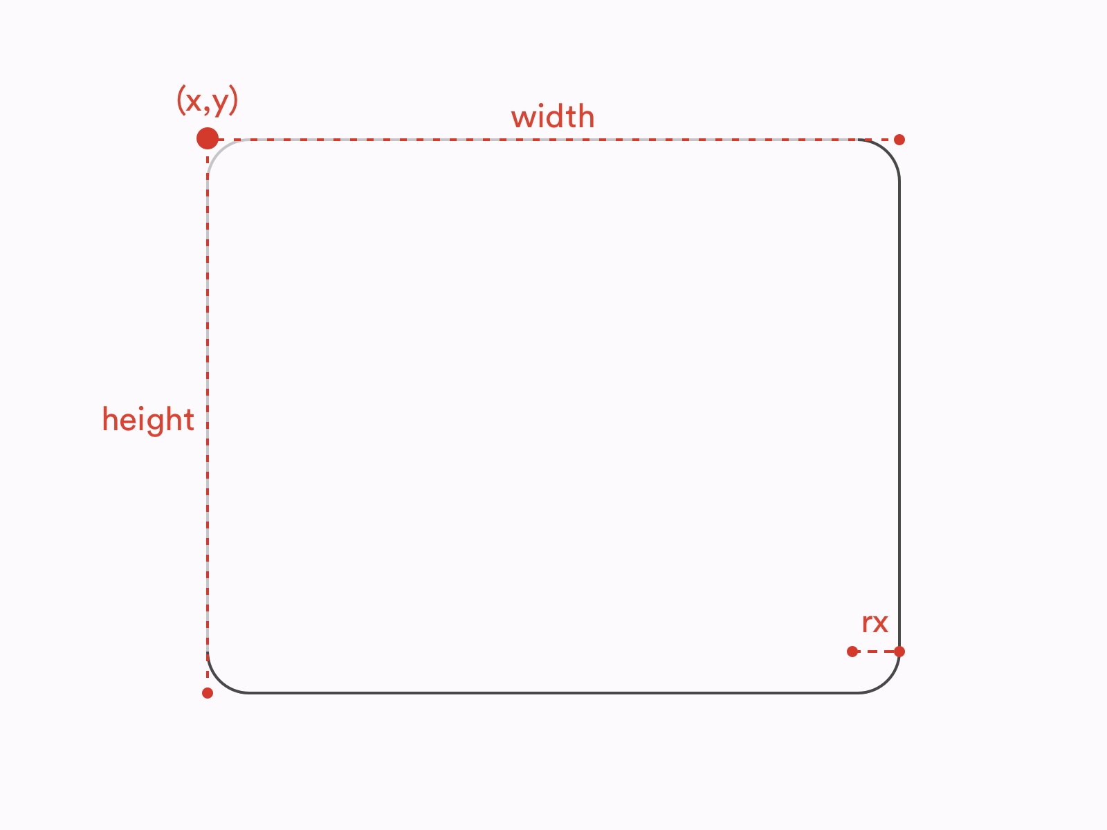
Example 3 – Rounded rectangle (very popular for buttons/cards/UI)
|
0 1 2 3 4 5 6 7 8 9 10 11 12 13 14 15 16 17 |
<svg width="400" height="180"> <!-- Sharp corners (rx=0 or omitted) --> <rect x="30" y="30" width="160" height="120" fill="#2196F3" rx="0"/> <!-- Slightly rounded --> <rect x="220" y="30" width="160" height="120" fill="#E91E63" rx="15"/> <!-- Very rounded (almost pill shape when rx ≥ half of smaller side) --> <rect x="30" y="200" width="340" height="80" fill="#FF9800" rx="40" ry="40"/> </svg> |
Key rule about rounding:
- If you set only rx → ry becomes same as rx
- If you set only ry → rx becomes same as ry
- If rx or ry ≥ half the width/height → you get very round / capsule shape
Here is how rx and ry actually bend the corners:
Example 4 – CSS hover effect (very common in modern websites)
|
0 1 2 3 4 5 6 7 8 9 10 11 12 13 14 15 16 17 18 19 20 21 22 23 24 25 26 |
<style> .card { transition: all 0.3s; } .card:hover { fill: #FFEB3B; stroke: #F57F17; stroke-width: 10; transform: scale(1.08); } </style> <svg width="320" height="180"> <rect class="card" x="40" y="40" width="240" height="100" fill="#673AB7" stroke="#512DA8" stroke-width="4" rx="12"/> <text x="160" y="95" font-size="28" text-anchor="middle" fill="white"> Hover me! </text> </svg> |
Try hovering — nice modern button feel, right?
Quick Cheat Sheet – When to use <rect>
| Goal | Use this… |
|---|---|
| Simple box / background | <rect> |
| Card with rounded corners | <rect rx=”12″ ry=”12″> |
| Pill / tag / button shape | <rect rx=”9999″> or big rx |
| Border only (no fill) | fill=”none” |
| Dashed border | stroke-dasharray=”8 4″ |
| Very complex shape | Use <path> instead |
Common beginner mistakes
- Forget width or height → nothing appears
- Put x=0 y=0 width=100% height=100% but forget <svg viewBox> → strange scaling
- Think y grows upward (like math class) → it grows downward
- rx=20 but width=30 → corners look strange (radius can’t be bigger than half size)
Ready for homework? 😄 Try to make:
- A red rounded square button that says “Click Me”
- A progress bar using two <rect> (one gray background + one green fill)
Paste your code here if you want feedback — I’ll review it like a real teacher!
Any part confusing? Just ask — we go again until it clicks! 🚀


