
Chapter 5: SVG circle
What is the <circle> element?
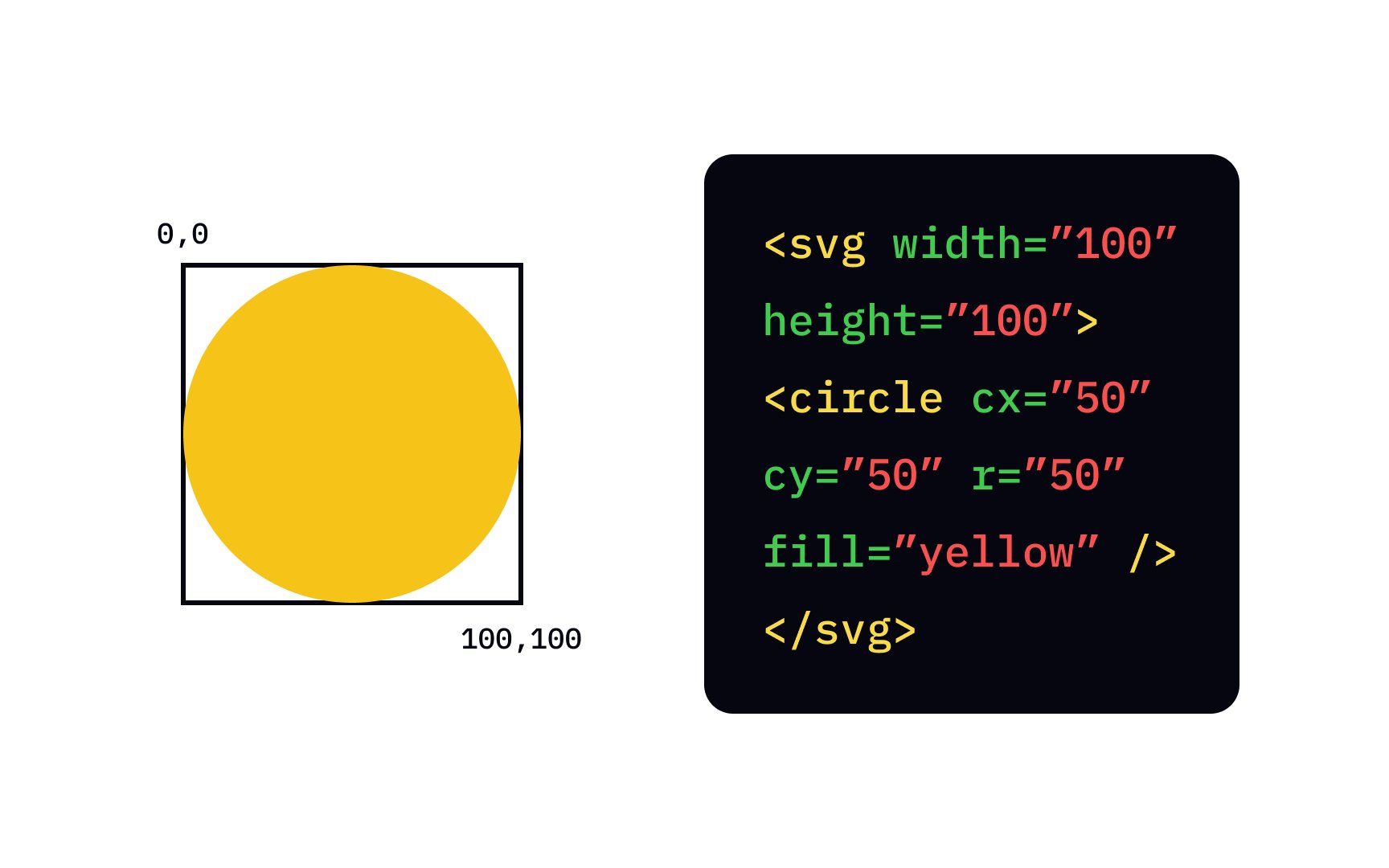
<circle> draws a perfect circle (or ellipse if you misuse it, but we normally use it for circles).
Unlike <rect> which starts from top-left corner, a circle is defined by its center point + radius.
That’s actually much more natural for round shapes!
The 3 absolutely essential attributes
| Attribute | Full name | Meaning | Required? | Default | Typical values |
|---|---|---|---|---|---|
| cx | center x | Horizontal position of the center | No | 0 | number, %, etc. |
| cy | center y | Vertical position of the center | No | 0 | number, %, etc. |
| r | radius | Distance from center to edge | Yes | — | number > 0 |
Remember SVG coordinate rules (very important):
- (0,0) = top-left corner of the <svg>
- x → increases right
- y → increases down
Here are some clear diagrams showing how cx, cy, r work compared to rect and line:

Example 1 – Simplest possible circle (centered)
|
0 1 2 3 4 5 6 7 8 9 10 11 12 13 14 15 |
<svg width="220" height="220" style="border:1px solid #ccc; background:#f8f9fa;"> <circle cx="110" cy="110" r="90" fill="#FF5722" /> </svg> |
Result: Big orange circle nicely centered in a 220×220 box (110 is exactly half of 220 → perfect center)
Example 2 – Circle with stroke (border) – very common
|
0 1 2 3 4 5 6 7 8 9 10 11 12 13 14 15 16 17 18 19 20 21 22 23 |
<svg width="300" height="180"> <!-- Just fill --> <circle cx="80" cy="90" r="60" fill="#4CAF50"/> <!-- Fill + stroke --> <circle cx="220" cy="90" r="60" fill="#2196F3" stroke="#0D47A1" stroke-width="12"/> <!-- Only stroke (no fill) --> <circle cx="150" cy="250" r="50" fill="none" stroke="#E91E63" stroke-width="8"/> </svg> |
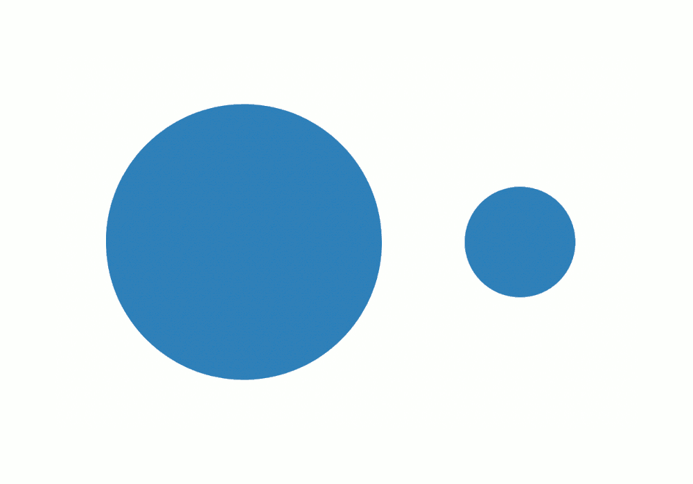
Example 3 – Many circles (dots, bubbles, loading indicator style)
|
0 1 2 3 4 5 6 7 8 9 10 11 12 13 |
<svg width="400" height="140"> <circle cx="70" cy="70" r="50" fill="#FF9800"/> <circle cx="170" cy="70" r="35" fill="#9C27B0"/> <circle cx="250" cy="70" r="22" fill="#00BCD4"/> <circle cx="320" cy="70" r="12" fill="#F44336"/> </svg> |
Example 4 – Circle as button / icon with hover (modern UI favorite)
|
0 1 2 3 4 5 6 7 8 9 10 11 12 13 14 15 16 17 18 19 20 21 22 23 24 25 26 27 28 29 30 31 32 33 34 |
<style> .btn-circle { cursor: pointer; transition: all 0.3s ease; } .btn-circle:hover { fill: #FFEB3B; stroke: #F57F17; stroke-width: 10; transform: scale(1.15); filter: drop-shadow(0 6px 10px rgba(0,0,0,0.3)); } </style> <svg width="180" height="180"> <circle class="btn-circle" cx="90" cy="90" r="70" fill="#673AB7" stroke="#512DA8" stroke-width="5"/> <text x="90" y="105" font-size="52" text-anchor="middle" fill="white" font-family="Arial, sans-serif"> GO </text> </svg> |
Hover over it — feels like a real button!

Example 5 – Circle used for progress ring (very popular pattern)
(This one uses <circle> twice — background + progress arc. Full version often uses stroke-dasharray.)
|
0 1 2 3 4 5 6 7 8 9 10 11 12 13 14 15 16 17 18 19 20 21 22 23 24 25 26 27 28 29 30 31 32 |
<svg width="140" height="140" viewBox="0 0 140 140"> <!-- Background circle (gray track) --> <circle cx="70" cy="70" r="60" fill="none" stroke="#e0e0e0" stroke-width="14" /> <!-- Progress circle (orange arc) --> <circle cx="70" cy="70" r="60" fill="none" stroke="#FF9800" stroke-width="14" stroke-dasharray="377 377" <!-- 2π×60 ≈ 377 --> stroke-dashoffset="100" <!-- controls progress --> transform="rotate(-90 70 70)" /> <text x="70" y="80" font-size="32" text-anchor="middle" fill="#333"> 73% </text> </svg> |

Quick Cheat Sheet – <circle> vs <rect>
| Goal | Use <circle> when… | Use <rect> when… |
|---|---|---|
| Perfect round shape | Yes — natural choice | No (needs big rx/ry) |
| Button, avatar, dot | Yes | Sometimes (rounded rect) |
| Progress ring / gauge | Yes (with stroke-dasharray) | No |
| Box / card background | No | Yes |
| Need exact center positioning | Yes (cx/cy very convenient) | No (have to calculate center) |
Common beginner mistakes with <circle>
- Forgetting r → nothing shows
- Putting cx=0 cy=0 r=50 → circle is half-cut because center is at top-left
- Thinking radius is diameter (no — radius = half the width)
- Using very small stroke-width on huge radius → looks invisible
Ready to practice?
Try these mini-challenges:
- Make three overlapping circles with different colors and transparency (use opacity=”0.7″)
- Create a simple “target / bullseye” using 4 concentric circles
- Make a pulsing circle animation with CSS @keyframes (scale + opacity)
Paste your code here if you want — I’ll review it like we’re in class together 😊
Any part still fuzzy? Just point and ask — we’ll zoom in until it’s crystal clear! 🚀


